How the current MSTP newsletter logo came to be
by JooEun ‘Jay’ Kang (M4)
On June 2017 as I was finishing up my M1 year, my big sib Abin Abraham (Class of 2022) and Rachel Brown (Class of 2023) requested for an MSTP logo and header to be made for the monthly MSTP newsletter. I love creating digital art, and for the past year really enjoyed making custom birthday cards for my friends.

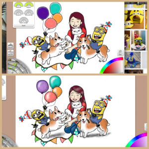
A card I made for a friend who loves – you guessed it—corgis and minions.
I had never designed logos before, but I had recently taught myself Adobe Illustrator and created illustrations for manuscripts as well as Snapchat geotags (remember those?) for VUSM’s Second Look Weekend 2017. I was ready for the challenge of creating a logo for Vanderbilt MSTP.
The art of logo making is that it can’t be too complicated or cluttered yet in the fewest elements convey everything that the logo is trying to represent. As I was brainstorming what would be a good visual representation of the “bed-to-bedside” nature of physician scientists, I immediately thought of a pipette and the stethoscope, two instruments symbolic of a scientist and physician. As for the shape of the logo, I intertwined them to pay homage to the medical caduceus symbol.
![]()

I then transformed the sketch to vector graphics using Adobe Illustrator, constructing first the pipette, followed by the stethoscope.
![]()
![]()
Next was determining color, which I initially thought gold and black to represent Vanderbilt colors, but with the feedback of the MSTP newsletter committee, decided that green and blue (MSTP color) looks better.

![]()
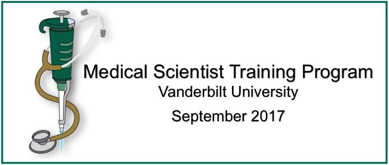
Once the logo and the header were combined, this was the official debut of the header in the MSTP August 2017 newsletter.
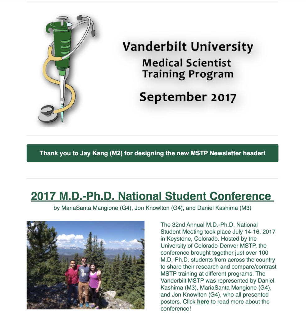
After a few edits, this version of the header graced the Vanderbilt MSTP Newsletter from September 2017 to June 2020.
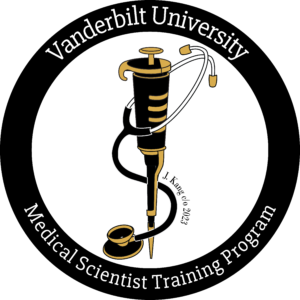
Fast forward to spring of 2020 and I had evolved to a G2 student, and our class was planning the MSTP 2020 retreat. The pandemic had just erupted, and we completely reorganized our in-person retreat for a virtual one. MSTP retreats always accompany new swag, and we decided that a modified MSTP newsletter logo would be a cool element of the retreat swag. After playing around with the colors, we landed back to the black and gold, now with the black circle with the Vanderbilt MSTP lettering. Everyone loved the t-shirts with this logo, and it has since been incorporated into other swags including sweatpants, water bottles, and journals.
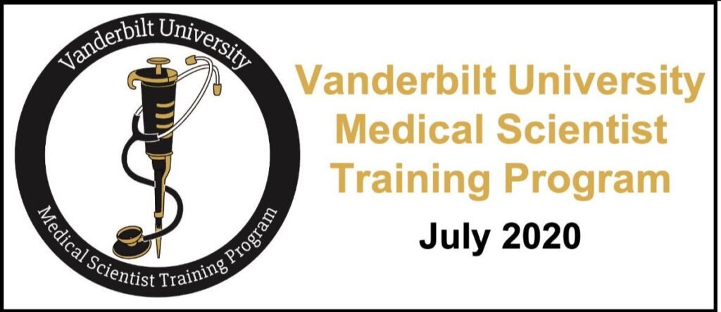
This new logo was incorporated into the MSTP Newsletter header starting July 2020.
Overall, I am so thankful that I was given the opportunity to contribute to the culture and fabric of Vanderbilt MSTP, and that this logo has been loved through multiple MSTP generations.